Small-town crimes never fall under the radar of national news unless it is something as ugly as murder, and even then, they are not given the same sensational reporting as some of the most trivial news. Yet that has never stopped Ed Brubaker and his accomplice Sean Phillips from finding something shady happening in the most mundane of places. The minds behind classics like Fatale and Criminal once again look to make comic books a respectable medium for the crime thriller genre, collaborating with Image Comics as usual as their publisher of choice. Their latest story takes place in a drab little corner of a sleepy town that may look unalluring at first but hides secrets within its secrets, like a mysterious nesting doll having the potential to destroy the lives it has touched.Written by Ed Brubaker with illustrations from Sean Phillips and colors from Jacob Phillips, Where The Body Was centers around a boarding house and its surrounding households on a picturesque street on a hillside named Pelican Road. Set in the year 1980, the story revolves around two young delinquents in an on-and-off relationship, a cheating wife and a self-absorbed husband, the stoic boyfriend whom people respect for flaunting around the police badge, a little girl playing superhero, and a homeless veteran – coexisting until their lives cross paths. When a private investigator tries to find one of the delinquents, a runaway teenager, things do not go as planned for him. And his fate starts to unravel all the lives on the block.With how the book meddles with relationships, illustrator Sean Phillips knows it is not the ambiance but the people at the forefront of the book. The reader realizes this as well once they see the characters staring right at them, telling them of their woes with sadness in their eyes. Sean Phillips’ illustrations are such that they evoke an emotional response. From dramatic scenes to passionate ones, his panels capture human beings acting out situations, whether rationally or irrationally. He employs a strict three-row rule for his panel work, using a traditional layout to create smaller panels to get up and close with the character while leaving the wider ones for action and atmosphere. Jacob Phillips’ colors majorly affect the latter, who uses secondary colors to play around with the time of the day. But, in reality, he sets up the mood and lets characters face their inner demons. Even in panels doused in a particular color, he brings in a contrasting shade to create shadows, giving a unique look to the book. The lettering also has a touch of class, with the fonts looking like something from a respectable newspaper, making the comic a reporting of sorts. Even the onomatopoeia gives off a sophisticated look, contrary to how they happen on the page.
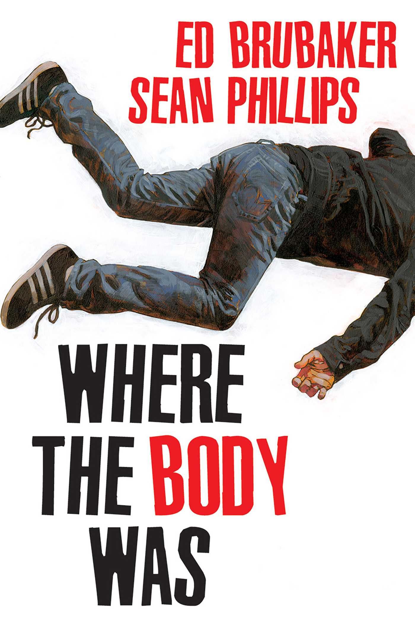
Small-town crimes never fall under the radar of national news unless it is something as ugly as murder, and even then, they are not given the same sensational reporting as some of the most trivial news. Yet that has never stopped Ed Brubaker and his accomplice Sean Phillips from finding something shady happening in the most mundane of places. The minds behind classics like Fatale and Criminal once again look to make comic books a respectable medium for the crime thriller genre, collaborating with Image Comics as usual as their publisher of choice. Their latest story takes place in a drab little corner of a sleepy town that may look unalluring at first but hides secrets within its secrets, like a mysterious nesting doll having the potential to destroy the lives it has touched.
Written by Ed Brubaker with illustrations from Sean Phillips and colors from Jacob Phillips, Where The Body Was centers around a boarding house and its surrounding households on a picturesque street on a hillside named Pelican Road. Set in the year 1980, the story revolves around two young delinquents in an on-and-off relationship, a cheating wife and a self-absorbed husband, the stoic boyfriend whom people respect for flaunting around the police badge, a little girl playing superhero, and a homeless veteran – coexisting until their lives cross paths. When a private investigator tries to find one of the delinquents, a runaway teenager, things do not go as planned for him. And his fate starts to unravel all the lives on the block.
With how the book meddles with relationships, illustrator Sean Phillips knows it is not the ambiance but the people at the forefront of the book. The reader realizes this as well once they see the characters staring right at them, telling them of their woes with sadness in their eyes. Sean Phillips’ illustrations are such that they evoke an emotional response. From dramatic scenes to passionate ones, his panels capture human beings acting out situations, whether rationally or irrationally. He employs a strict three-row rule for his panel work, using a traditional layout to create smaller panels to get up and close with the character while leaving the wider ones for action and atmosphere. Jacob Phillips’ colors majorly affect the latter, who uses secondary colors to play around with the time of the day. But, in reality, he sets up the mood and lets characters face their inner demons. Even in panels doused in a particular color, he brings in a contrasting shade to create shadows, giving a unique look to the book. The lettering also has a touch of class, with the fonts looking like something from a respectable newspaper, making the comic a reporting of sorts. Even the onomatopoeia gives off a sophisticated look, contrary to how they happen on the page.
#ADVANCE #REVIEW #Image #Comics #Body
Note:- (Not all news on the site expresses the point of view of the site, but we transmit this news automatically and translate it through programmatic technology on the site and not from a human editor. The content is auto-generated from a syndicated feed.))


